Scatter Plot Maker
y = mx + b
How to Use Scatter Plot Maker
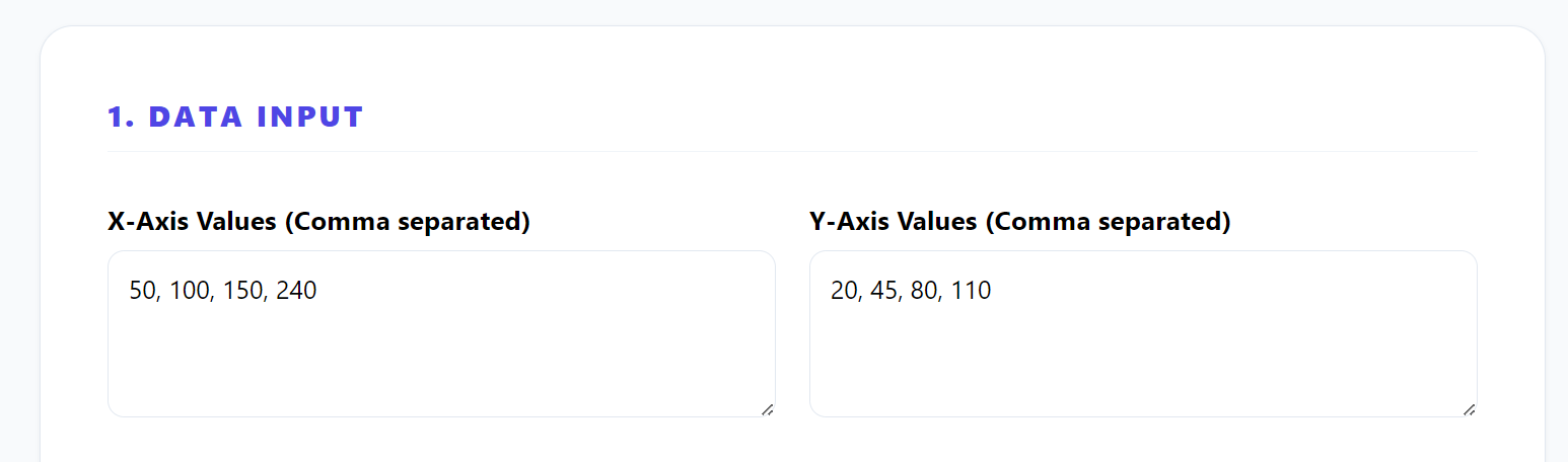
1. Add Your X and Y Data Values
Start by entering your X-axis and Y-axis values in the input fields. You can type them manually or paste it directly.
2. Make Sure Your Data Is Correct and Clean
Check that your data only contains numbers and is properly separated (comma or line break). Avoid text or empty spaces, as this can cause errors in the graph.
3. Click the Button to Create the Scatter Plot
Once your data is ready, click the “Generate Graph” button. The tool will instantly generate a scatter plot based on your values.
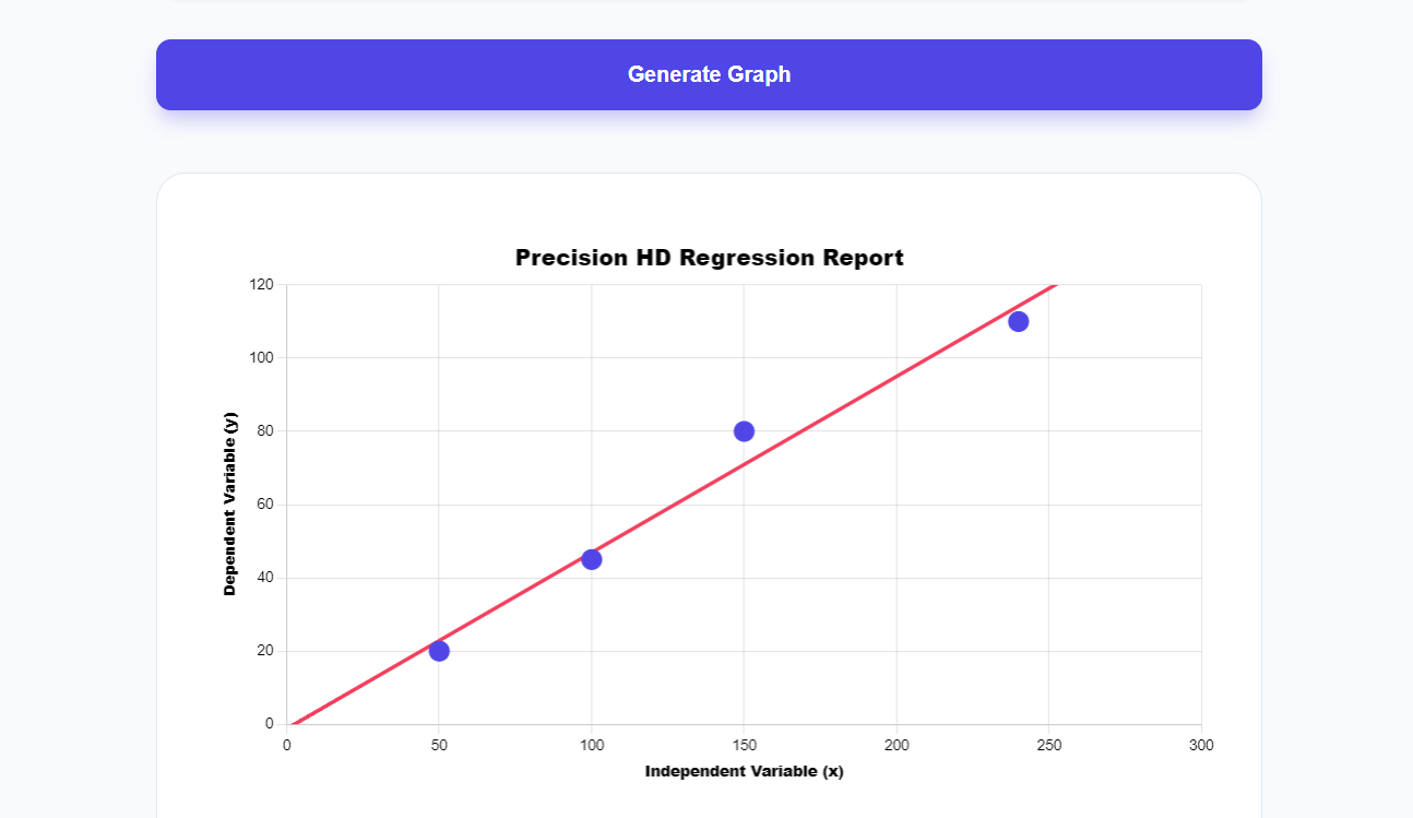
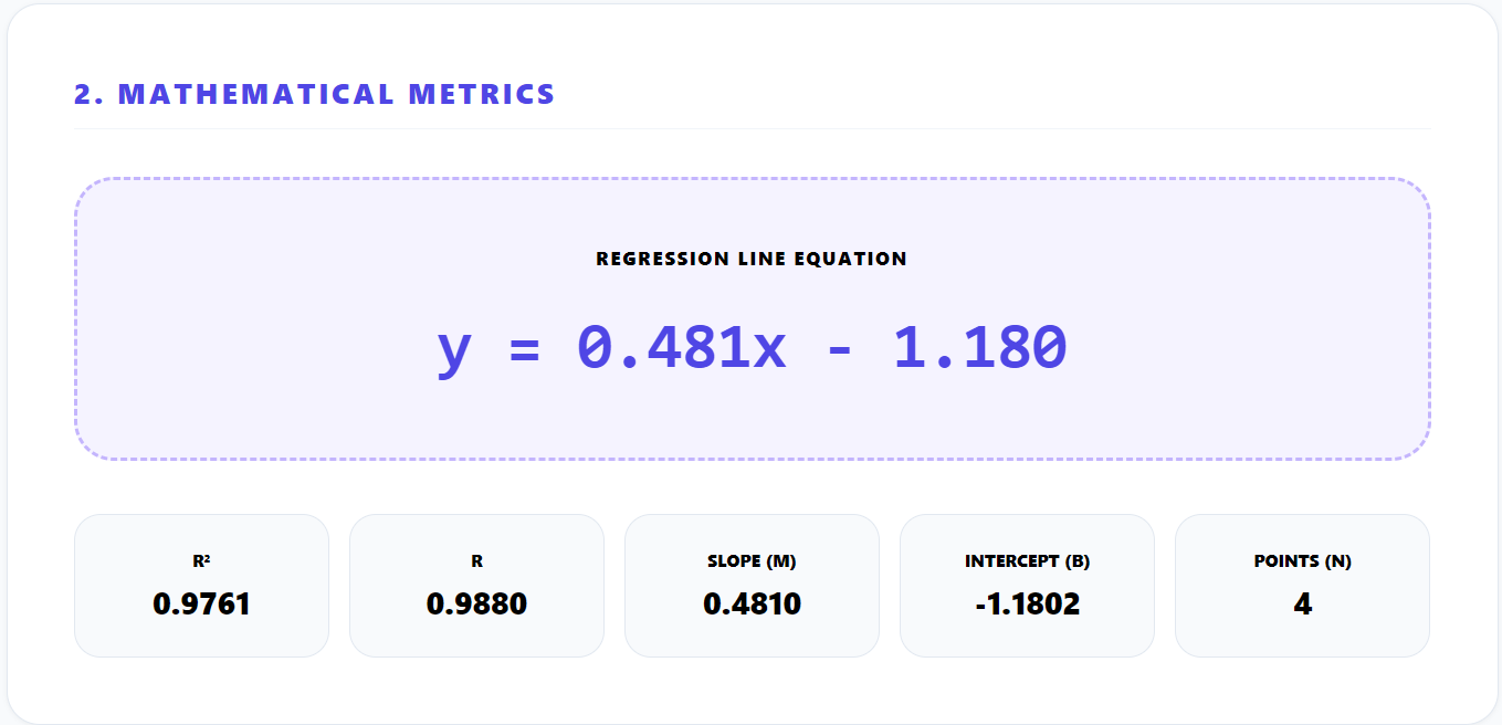
4. See the Regression Line trend and Mathematical Metrics
After the graph appears, the regression line will be shown automatically. This line helps you understand the relationship between your variables, such as increasing or decreasing trends.
You can also get mathematical metrics that can help you.
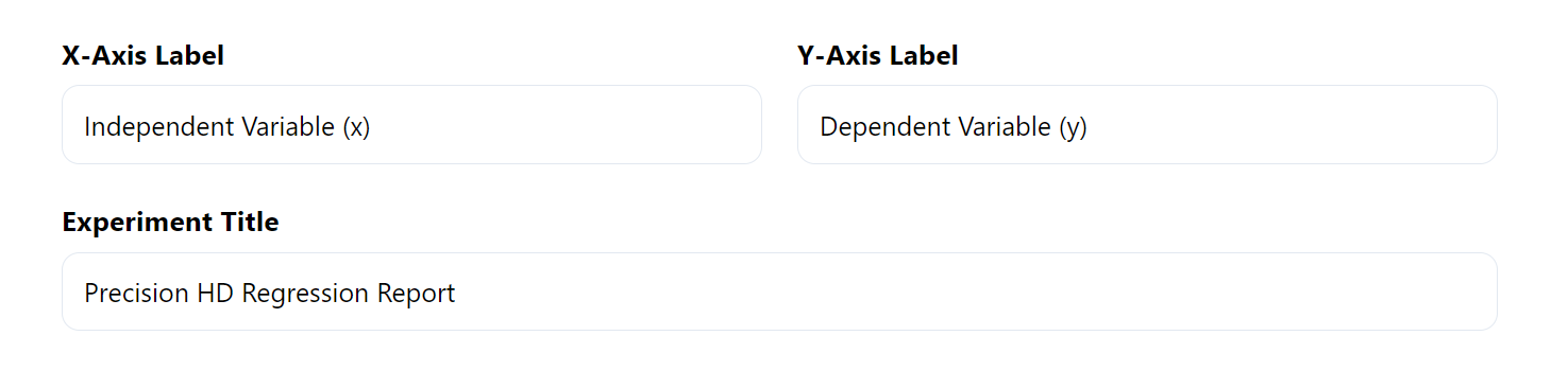
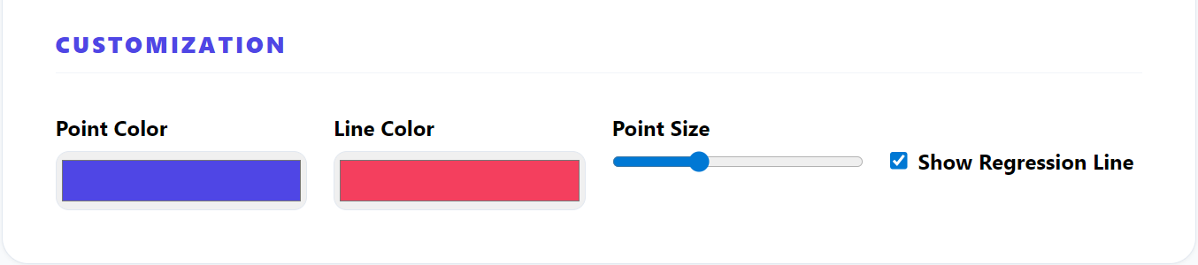
5. Edit Labels, Colors, and Chart Settings
Customize your graph by changing the title, axis labels, and colors. This helps make your graph more clear and professional.
You can also changes the regression line color with the point color according to your theme
6. Download the Graph For Free
When your graph is ready, you can download it as PNG or JPG image . You can use it in reports, presentations, or online content.
Key Mathematical Formulas Used In Scatter Plot
Line of Best Fit (Linear Regression)
Where m represents the slope and b represents the y-intercept.
Slope Formula (m)
Calculates the slope of the regression line, showing how much y changes for each unit increase in x.
Y-Intercept Formula (b)
Determines where the regression line crosses the y-axis when x equals zero.
Correlation Coefficient (r)
Measures the strength and direction of the relationship between two variables in a scatter plot.
Coefficient of Determination (R²)
Indicates how well the regression line fits the data, with values closer to 1 showing a better fit.